Content for Homepage of a Website You Have to Nail
Enhancing Your Website's First Impression: Mastering Above-the-Fold Content
The Homepage is the most visited page on most websites, it is vital. But I have a spoiler alert….they aren’t going to look at the content on the homepage of a website unless you get their attention in a split second.
There is one super important section on your homepage that you have to nail so that they keep scrolling…..
Grabbing a website visitor's attention within the initial 5-7 seconds is nothing short of an art. It is absolutely crucial!
Within this brief timeframe, you have to ensure this homepage has an above-the-fold section that shines, succinctly showcasing your brand's essence, audience, and unique value proposition.
This space, the first thing a visitor sees before any scrolling, is your digital storefront—a place to captivate and convert.
Again, the short attention span and hurried consumer doesn’t want to scroll for days looking to see who you are/what you do/ and find what they want!
So we have to make this our number one priority to achieve great results on our website when they land on our homepage.
Let's dive into crafting above-the-fold content that encapsulates your brand distinctively and ensures a memorable first impression.
Get Your Hands On
My Free TRELLO BOARD
What is Above-the-Fold??
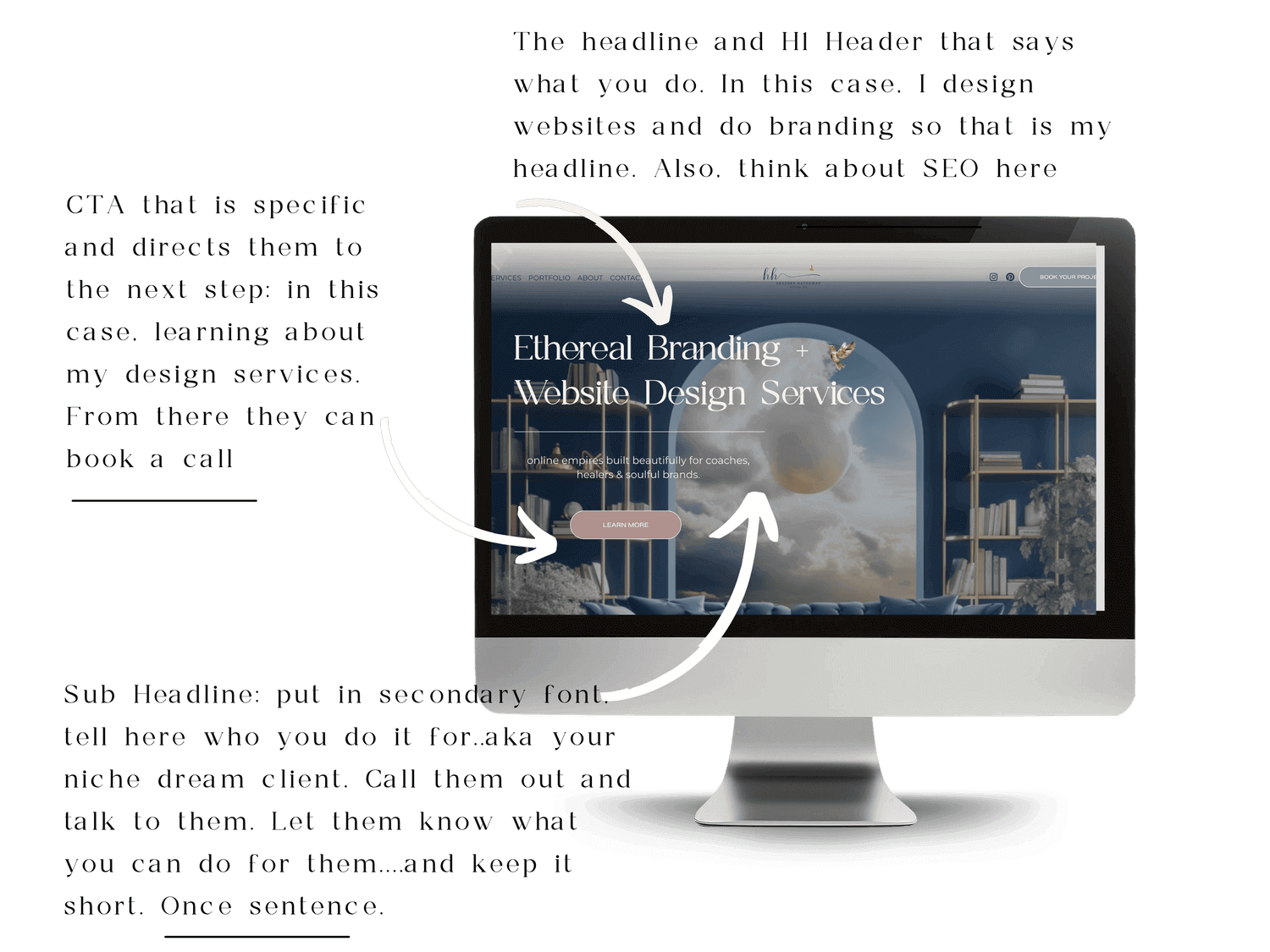
this entire screen capture is the above fold area on a desktop.
If the term "above-the-fold content" is new to you, let's demystify it.
This refers to the section of a webpage visible on a screen when the page first loads, before any scrolling occurs.
So basically as the vistor starts to scroll to see the rest of the content, that is no longer the section “above'-the-fold”.
This is why it’s so important to master because website visitors land and bounce all day long on websites. Many visitors stay just a few seconds….how do you get them to stay longer and convert?
Yep, get the above the fold correct on your homepage!
This is truly the most important part of your entire homepage and arguably your entire website.
It's akin to a captivating storefront display, offering a glimpse of what your brand represents and inviting visitors to explore further. This area is your virtual prime real estate, deserving thoughtful optimization.
Check Out Why Squarespace Is a Great Platform to Build a Website On
review these 3 important assets on your above the fold section.
Crafting a Compelling Brand Introduction
One of the most impactful strategies to optimize your homepage's above-the-fold content is by encapsulating a clear, concise brand introduction that outlines your brand's identity, target audience, and value proposition.
This statement, often termed the 'brand bio,' is a simple yet powerful update that can significantly enhance engagement.
When visitors can swiftly comprehend what you do, who you cater to, and how you add value, their interest to explore further deepens.
Example Brand Introduction:
Add this to your to-do list.
Bookmark this blog for later so you can run your checklist.
What we do: Crafting unique and intuitive web designs for forward-thinking businesses.
Who we serve: Visionary startups and small businesses striving for digital excellence.
How we add value: Empowering you to leave a lasting online impression and drive meaningful user engagement.
And where do we put this information? You guessed it, above the fold!
You know this as the Headline, Sub Headline, and Clear Call to Action!
Maximizing the Brand Introduction's Impact
Once you've refined your brand introduction, strategically integrate it throughout your website, not confining it to just the homepage.
Ensure consistency across your about page, services page, and social media profiles. Reinforcing your brand's identity and value proposition consistently builds trust, and credibility, and keeps your brand at the forefront of your audience's mind.
Compelling Calls to Action (CTAs)
Guide your audience effectively by positioning clear calls to action (CTAs) just below your brand introduction.
Whether it's prompting them to schedule a consultation, subscribe to your newsletters, or access a downloadable resource, tailor your CTAs to align with your website's ultimate goal. Let these CTAs serve as signposts, directing visitors towards their next interaction with your brand.
For example, if you aim to encourage consultation bookings, a well-placed button below your brand introduction can direct them to a dedicated services page. Pepper your content with multiple CTAs, inviting visitors to take vital steps and engage more deeply with your brand.
In web design land, these CTAs are termed as call to action (CTA) buttons. Remember, clarity is of the essence when it comes to CTAs. Opt for straightforward and impactful wording that leaves no room for ambiguity regarding the desired action.
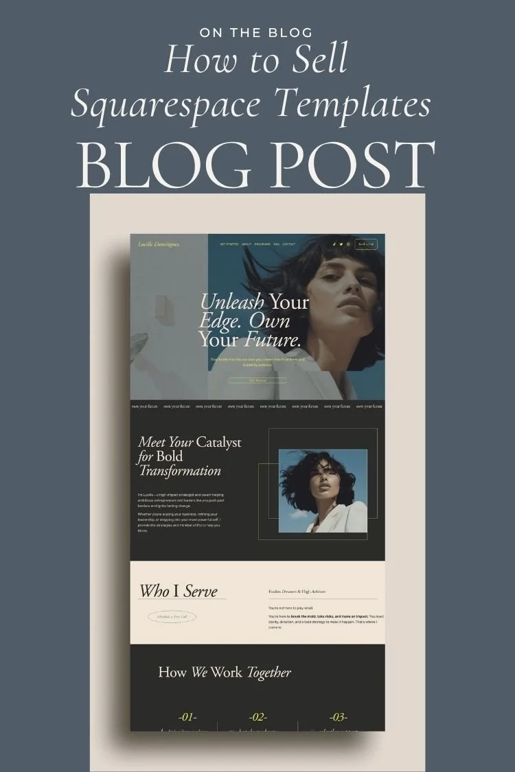
An Example Hero Image for above the fold.
Images Above the Fold
When it comes to web design, above-the-fold images are your virtual storefront, offering an immediate impression of your brand. These images hold immense importance for visitor engagement and conversion.
Here's a list of things you need to take into consideration:
On-Brand: Above-the-fold images should align with your brand's visual identity. Consistency in color schemes, typography, and style helps reinforce brand recognition.
Beautiful & Compelling: The visual appeal is paramount. These images should be aesthetically pleasing and evoke an emotional connection, making visitors want to explore further.
Strategically Placed: Placing key images where they immediately draw attention is vital. These images can guide the user's eye towards important content or calls to action.
Non-Distracting: While captivating, above-the-fold images should not overwhelm. They must complement the content without diverting the visitor's focus.
Optimized for Speed: Compressed PNGs are a smart choice. They maintain image quality while ensuring quick loading times, essential for a seamless user experience.
The Crucial Role of SEO in Above-the-Fold Strategy
Search Engine Optimization (SEO) plays a pivotal role in ensuring your website's visibility. Above the fold, this is evident in two key aspects:
H1 (Headline) Optimization: The H1 tag serves as a headline for your page, conveying the primary topic to both users and search engines. It's imperative that the H1 is strategically positioned above the fold, as it helps Google understand your site's main keywords and content focus, thus improving your chances of ranking for relevant search queries.
Incorporating SEO into your above-the-fold strategy involves optimizing your H1 to reflect your core keywords, ensuring they are aligned with your content and search intent.
Remember, above-the-fold elements, such as images and H1, are the gateways to your website's content. They set the tone for your brand's online presence and are integral to a successful digital strategy and getting ranked on the first page.
Concluding Thoughts
Optimizing the above-the-fold content on your homepage is a critical step in presenting your brand with maximum impact.
By crafting a crystal-clear brand introduction and strategically placing compelling CTAs, you not only capture those crucial first 7 seconds but also guide your visitors toward meaningful interactions with your brand.
Embrace these strategies, customize them to align with your unique brand identity, and witness your homepage transform into a magnet for your ideal audience.
In the realm of digital presence, remember that this journey is ongoing. Stay consistent, adapt, and continually refine to ensure your brand shines and resonates with your audience, creating a lasting digital impression.
Pro Tip: If you are able to A/B test your homepage, I would highly recommend it.
You can try different CTA texts, change button colors, change your headline, images, etc.
Checklist: Assessing Your Above-the-Fold Content
Ok, let’s recap everything you should check today to ensure you are utilizing your prime real estate aka above the fold, properly to turn browsers into raving fans.
Use this checklist to evaluate and optimize the above-the-fold content on your website's homepage.
Clarity of Brand Introduction:
Is your brand's identity, target audience, and value proposition clearly articulated in a concise statement?
Does the brand introduction convey what you do, who you serve, and the unique value you provide?
Visibility and Readability:
Is the above-the-fold content easily visible without the need for scrolling on various devices (desktop, tablet, mobile)?
Are the font styles, sizes, and colors chosen for the text easy to read and visually appealing?
Check Out Creating an Engaging Website: A Typography Checklist for Exceptional UX!
Strategic Use of Imagery:
Are there compelling and relevant images or visuals that support and enhance the brand message?
Do the images align with your brand's tone, purpose, and target audience?
CTA Presence and Clarity:
Is there a clear call to action (CTA) positioned below the brand introduction, guiding visitors to take the desired action?
Is the CTA button distinct, well-designed, and accompanied by a compelling message encouraging action? Are you using your defined accent color for this button?
Consistency with Branding Elements:
Are the branding elements (colors, fonts, logo) consistent with the rest of the website and brand identity?
Do the branding elements in the above-the-fold section align with the overall brand style and aesthetics?
Loading Speed and Performance:
Is the above-the-fold content optimized for fast loading, ensuring a seamless user experience?
Have you tested the page's loading speed and made necessary adjustments for optimal performance?
Relevance and Alignment:
Does the content above the fold align with the visitor's expectations based on your marketing messages or ads?
Is the above-the-fold content tailored to resonate with your target audience and their specific needs or interests?
Exercise: 5-Second Brand Impression Test
Perform this exercise to evaluate how effectively your above-the-fold content communicates your brand's essence within the critical first 5 seconds of a visitor's arrival.
Invite a Peer or Friend:
Ask a colleague, friend, or someone unfamiliar with your website to visit the homepage.
Set the Timer:
As they land on the homepage, set a timer for 5 seconds or if they are doing it remotely, ask them to just try to pause after 5 seconds and do a quick reflection for you.
Ask for Insights:
After the 5 seconds, ask them to recall what they saw and what they believe your brand represents.
Evaluate Their Perception:
Assess if their feedback aligns with your intended brand message and if they grasped the key aspects of your brand within the brief time frame.
Iterate and Refine:
Use their feedback to make necessary adjustments to the above-the-fold content for a clearer and more impactful brand introduction.
This exercise helps you gauge the effectiveness of your above-the-fold content in quickly conveying your brand's message to a new visitor.
Wrap it up!
I know, that’s a lot! Web design is no joke. It takes dedication and educating yourself if you are DIYing it. Content for Homepage of a Website is of no avail unless you get the above the fold section correct. Work on that first, and then keep working your way down.
Consider my services to get you to the next level. Not only with your branding, vibe, and design. but with the most important aspect for a business owner: conversions!
Check it out! Or drop me a line at heather@heatherhathaway.com and let me know your thoughts.
Hugs,
Heather


