SIGNATURE BRAND + WEB PACKAGE + COPY
Candace-Salon Coach and Business Mentor
Candace runs an awesome program to help female salon owners increase their income without increasing their 1/1 time with clients.
Project Overview
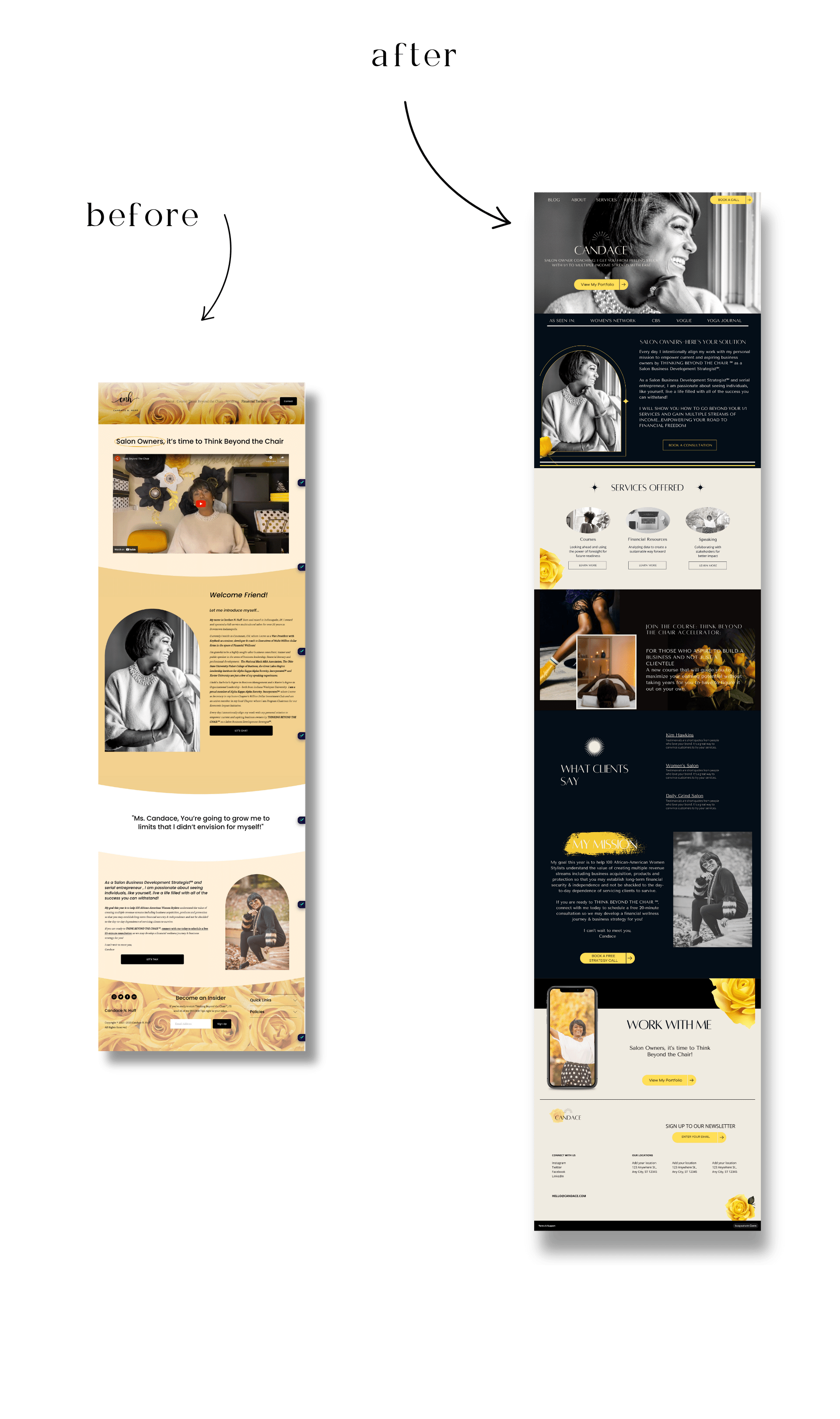
Candace needed a complete restructure for her Homepage.
We started from the top down with first, the navigation.
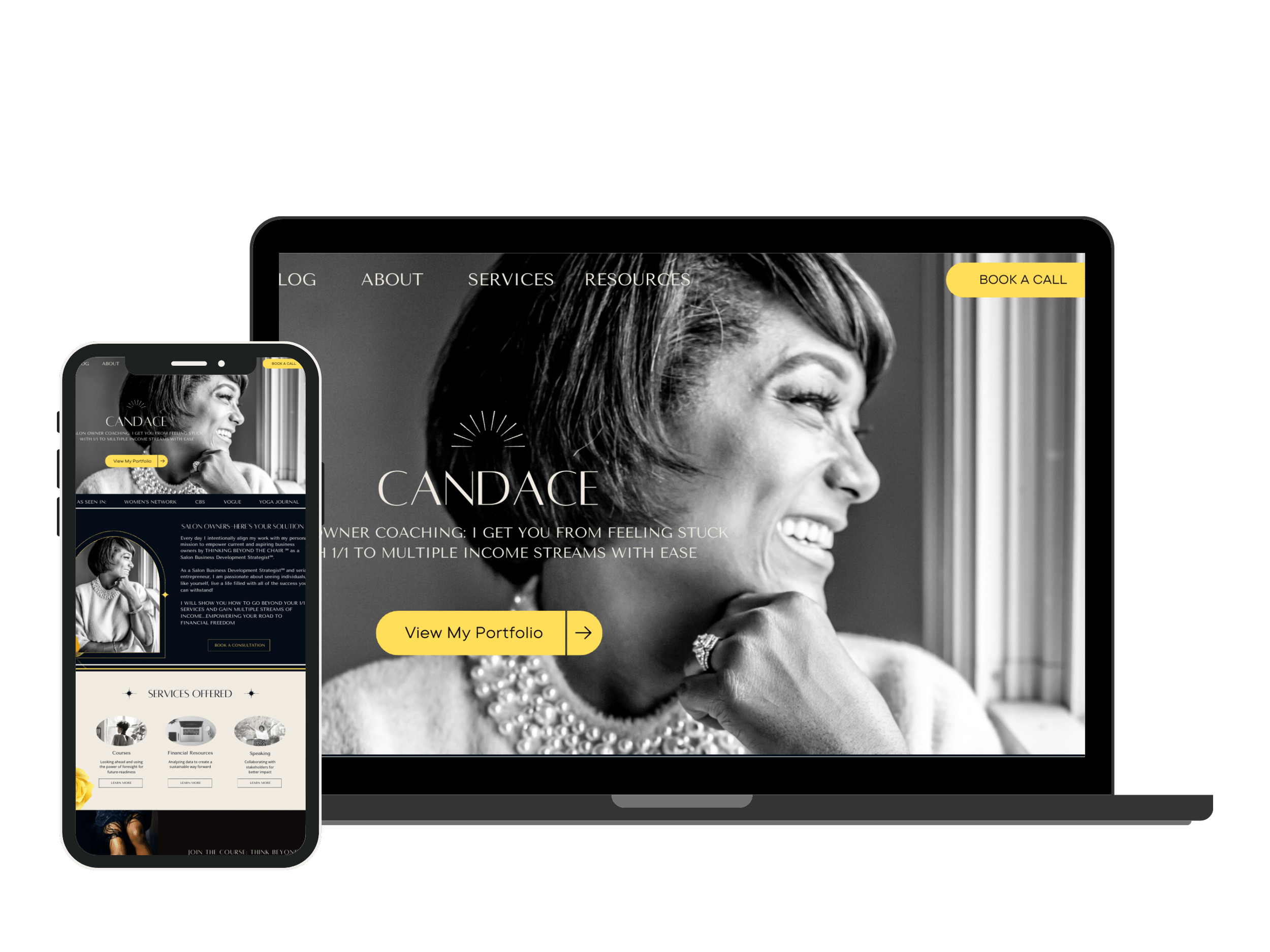
We fixed it so that she has a clear navigation menu and has a clear call to action right at the top.
Next, we fixed the above the fold section. This section is extremely important. Read the blog here on how to fix your above the fold if you haven’t yet.
She originally had an embedded Youtube video which I removed from the above the fold section and added in her beautiful headshot with strategic headline and subheadline and Call to Action.
Spotlighting Candace and her Mission
Candace is just a stunning woman and this photo of her is simply exquisite so I started with this beautiful hero image of her.
I wanted to create a powerfully branded website to go along with her powerful mission you can read below:
“My goal this year is to help 100 African-American Women Stylists understand the value of creating multiple revenue streams including business acquisition, products and protection so that you may establish long-term financial security & independence and not be shackled to the day-to-day dependence of servicing clients to survive.”
COLOR & TYPOGRAPHY
The overall vibe and mood for Candace
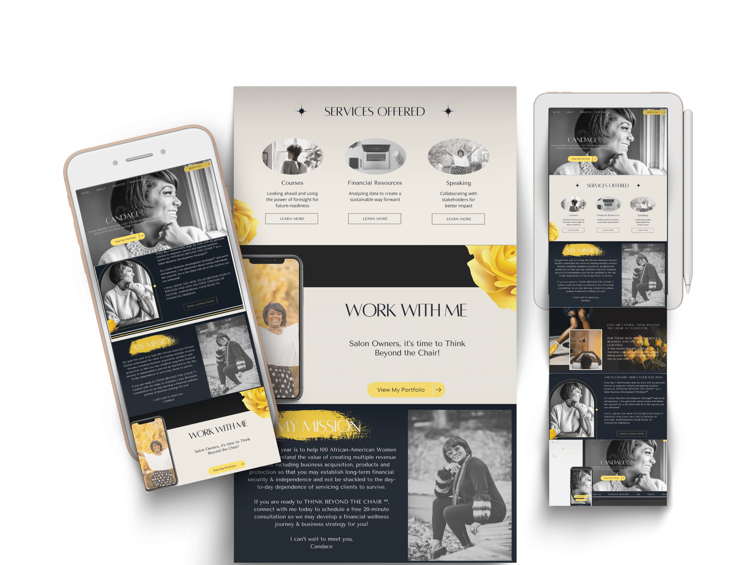
Candace’s mission is to empower women hence the strong color scheme that fits beautifully with her black and white photography.
Candance is fond of yellow roses so I made sure to incorporate the yellow roses at her request which gave it a nice pop of color.
Specifically standing out are the yellow Call to Action buttons that were missing before.
Candace’s site that she had previously designed by herself had no clear customer journey.
We always want to create a super clear road map for the customer journey.
Her menu was confusing, the above the fold section did not have a headline or CTA and her main offering was not highlighted.
We fixed all of this with UX best practices and web design built for conversions and beauty!
Conversion-led, bespoke website design
Services and Offerings
Grouping things into multiples of 3’s is really great for buyer psychology and getting the user to understand in a 3 step process, what it is you do and what they should do about it.
Breaking down Candace’s program into 3 steps was a crucial part of the conversion/design process.
Your dream website design is just a few short steps away.
Turning your vision for a wellness or coaching brand and website into reality is simpler than you think.
Reach out to our skilled design team today, and let's embark on this creative journey together.


