SIGNATURE BRAND + WEB PACKAGE + COPY
Ayurveda, Nutrition & Yoga Coach
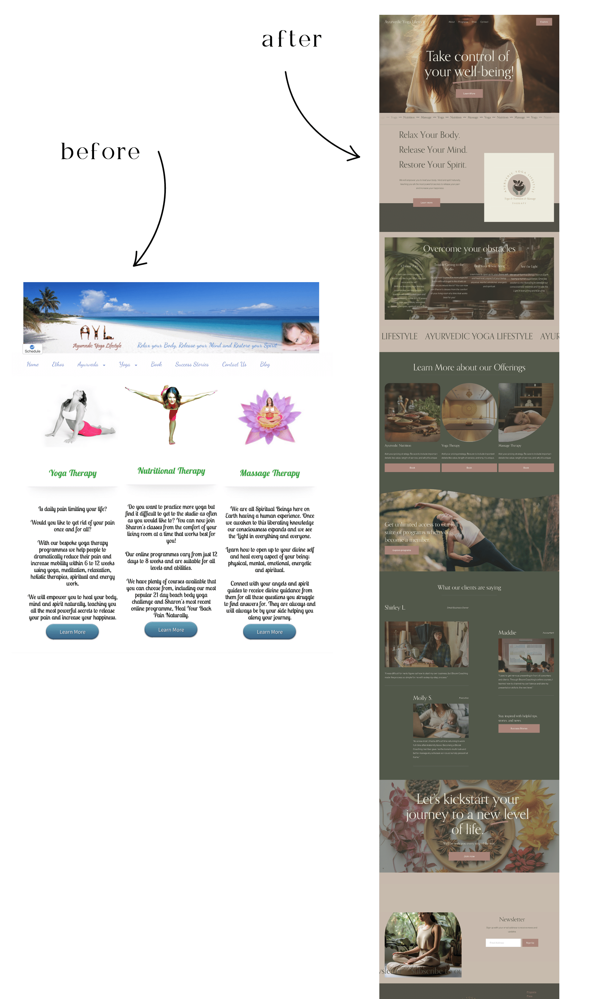
Sharon runs this amazing membership, blog, and classes to help people heal through yoga and meditation and become the best version of themselves! Ayurvedic Yoga Lifestyles. This brand received a major overhaul with a complete rebrand and update.
Project Overview
Sharon needed a thorough update with her site. She has had her blog for many years but the design was outdated and needed some branding love.
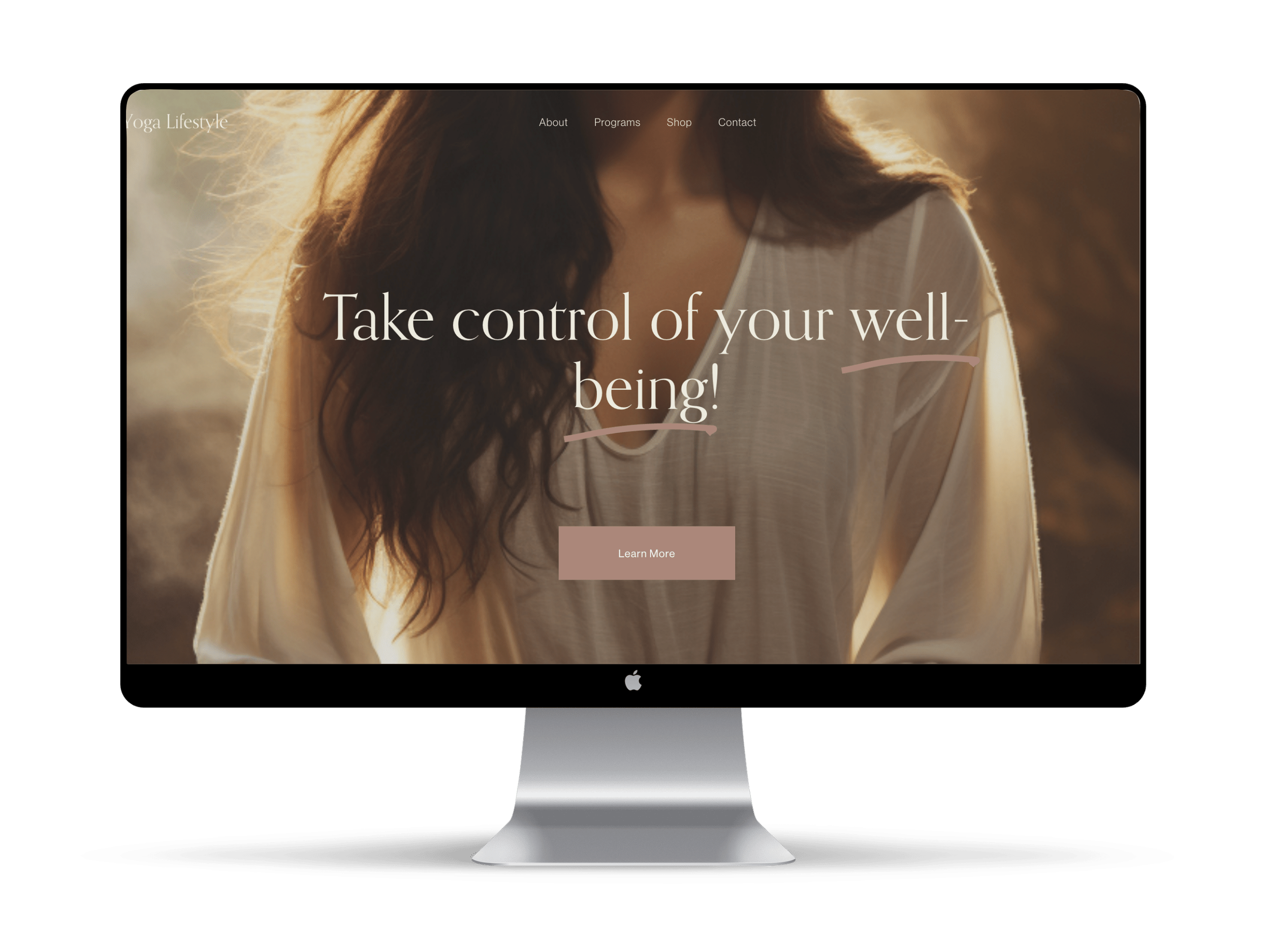
I first started by crafting her some images in Midjourney that reflected her brand values and ideal client.
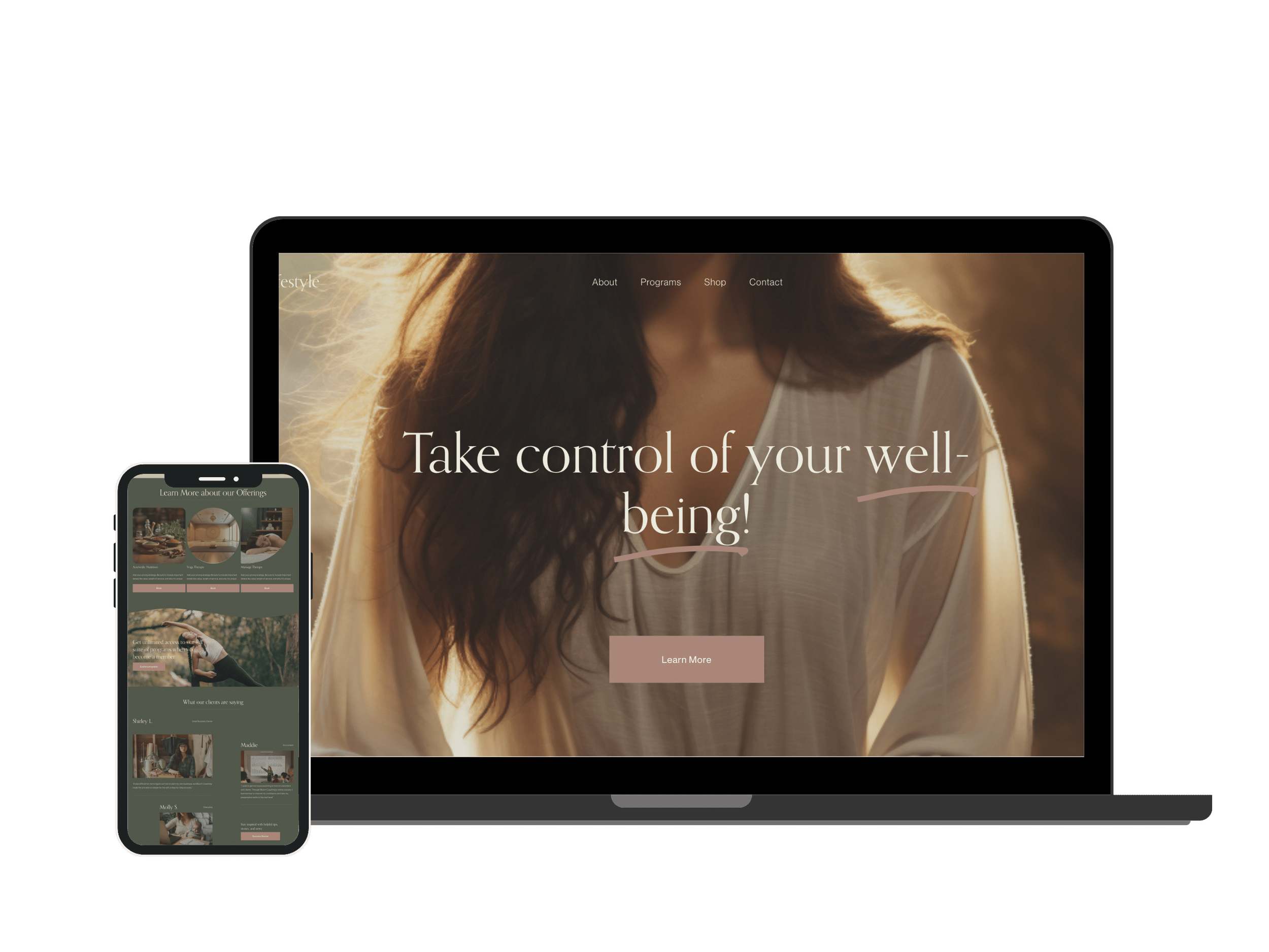
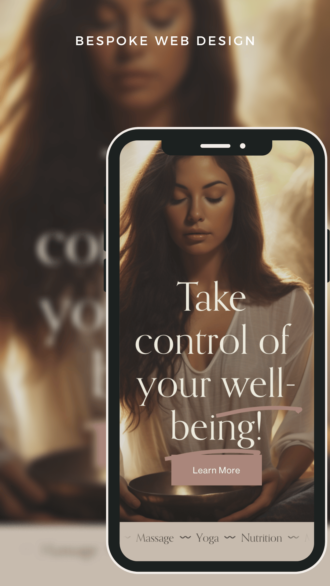
We fixed it so that she has a clear navigation menu and has a clear call to action right at the top.
Next, we fixed the above the fold section. This section is extremely important. Read the blog here on how to fix your above the fold if you haven’t yet.
I added many more sections to her homepage to layout a clear road map for her web visitors.
Spotlighting Yoga, Meditation and Nutrition
Sharon has alot of amazing offerings with Yoga, Ayurvedic nutrition and massage therapy. On top of that, she has authored several books and has had her blog for many years.
We first had to layout a clear roadmap so that all of her offerings were understood and showcased, but not overwhelming the user.
I also made the menu much smaller so that her niche could be highlighted but not confusing.
We chose soothing greens for wellness and the lovely muted mauve color you see along with some earthy browns and dark browns for a pop of color.
COLOR & LOGOS
The overall vibe and mood for Ayurvedic Yogic Lifestyle
I wanted to present a healing oasis to Sharon’s clients right when they enter her site.
First impressions are huge, and we never get a second chance with those so it is a must that we keep our sites updated.
I updated Sharon’s with a more modern feel but also one that exudded wellness and healing.
Conversion-led, bespoke website design
Sharon’s site that she had previously designed by herself had too much to focus on and not one clear call to action.
We always want to create a super clear road map for the customer journey.
Her menu was confusing, the above the fold section did not have a headline or CTA and her main offering was not highlighted.
We fixed all of this with UX best practices and web design built for conversions and beauty!
MIDJOUIRNEY BESPOKE IMAGES
Not having to rely on stock photos is an absolute game changer.
Breaking down Sharon’s program into 3 offerings was a crucial part of the conversion/design process.
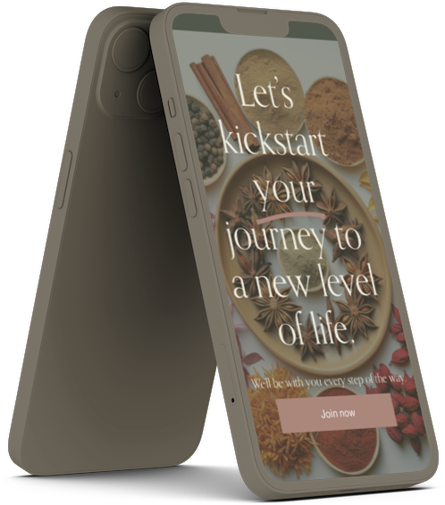
In Midjourney, I crafted all of the images that you see on her site. I kept in mind the Ayurvedic vibe but enhanced them with filters so that they blended in with the soothing and healing colors we selected.
the possibilities are endless and just a few steps away….
Your dream website design is just within reach.
Turning your vision for a wellness or coaching brand and website into reality is simpler than you think.
Reach out via the contact form today and let’s go on our creative journey together.


